Swift is the language of choice for the iPhone app. That is to say the only choice, and like everything else to do with apple it’s incompatible with almost everything else. You can’t swap your finished app over to google play or anything sensible like that. no.
The journey starts with an install of the XCODE tool. Its fairly good and not too difficult to use. On the surface its a drag and drop environment so you can build up whatever you want on the screen and make it look pretty, but here’s the rub. Not all iPhones are created equal. They have taken a variety of different sizes and shapes over the years from tiny iPhone 4s up to the latest iPad and any app has to be viewable on ALL these platforms. Your pretty picture soon falls apart when stretched around to suit a different device.
The layout issues are dealt with via constraints. So rather than saying that a picture is yay big and sits 100 pixels from the edge you say something like ..set the gap at the side of the screen to some value and let the picture auto fill in the space that’s left. Sounds simple but can lead to some rather odd results when you check it out on some other devices.
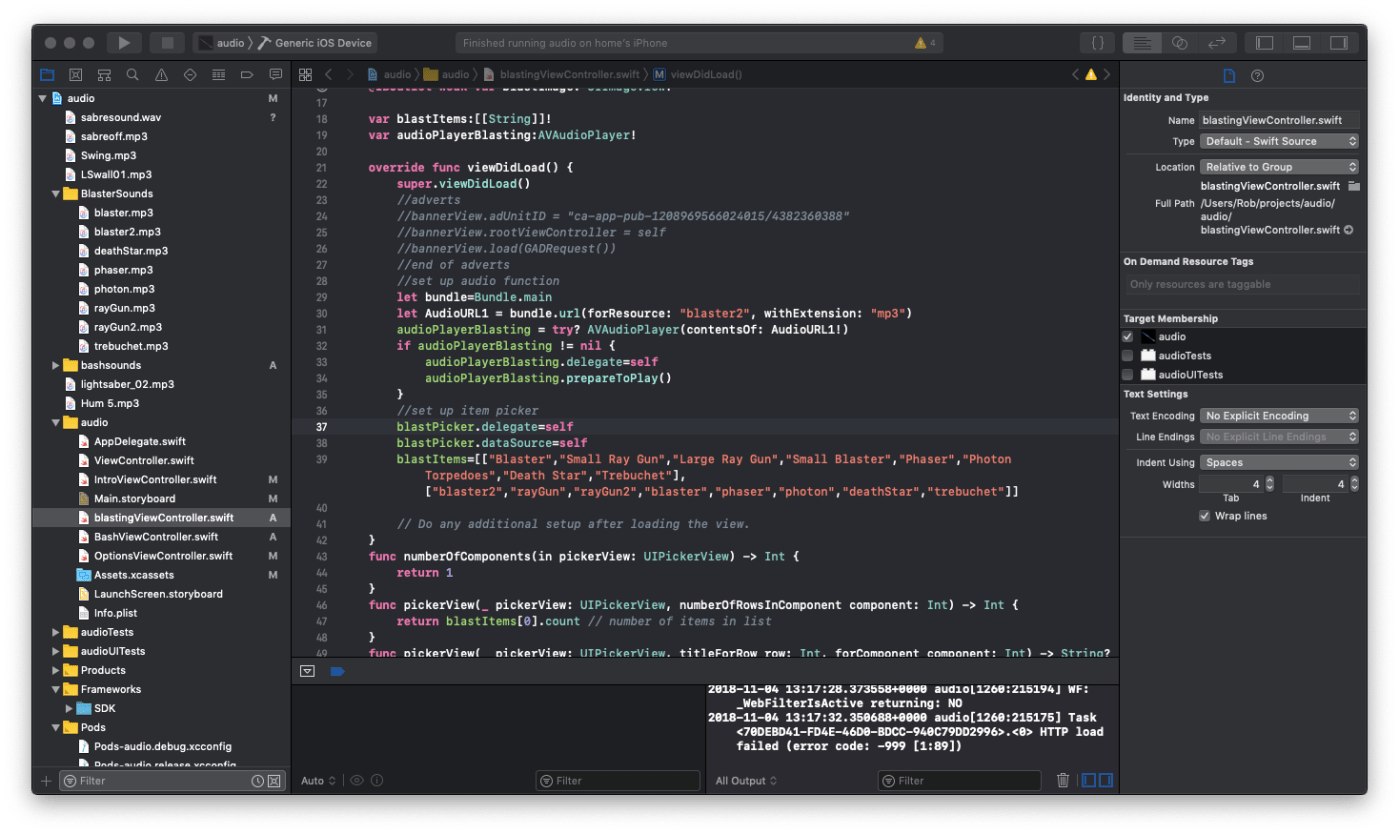
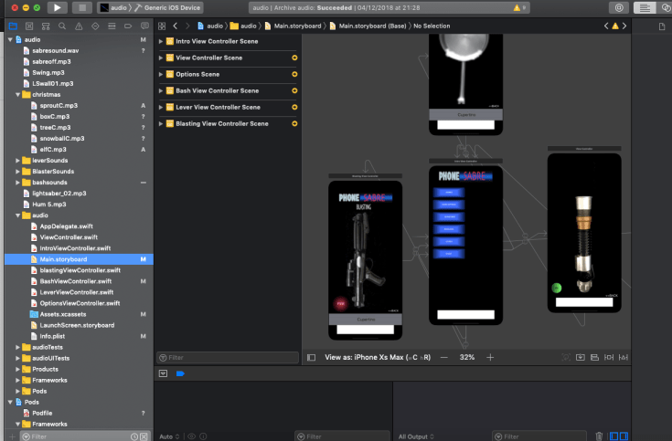
As you can see in the picture above XCODE lets you have a lot of different screens with ‘segues’ in between to travel amongst them (that’s the thin white arrows in the screenshot). Each one is a different screen for the user. In this way you can set up a whole set of different user experiences, each bringing something new to the app. Unfortunately I really only needed one screen, a lightsaber. However, in the interests of consumerism and ‘more is better’ I added a welcome screen with buttons.


As you can see it has basically one button which is ‘Start’. So having looked at it I thought perhaps I should add some more buttons to make it look a bit more professional. Of course the main issue (as I was to find out) was that the app was not really professional in the first place. Ignoring that fact I added a couple of greyed out buttons for options (god know what options) and ‘Customise’ (yes I know, customise what?). It didn’t matter because they were greyed out. Extra content to be purchased later using the final button ‘remove ads’ (yes the ads are those little banners at the bottom of the screen that I now know nobody bothers to pay to remove). I set it up so that if you clicked a grey button then a little window popped up and said ‘you have to upgrade to use this function’.
The other screen was the main one, the lightsaber. Something I drew up in 5 mins on a free drawing app. A quick cylinder with some shading and some rings on it. Cool, right? Well, no. In fact pretty rubbish. Not only did it not look the part but it didn’t even stay the same shape when viewed on iPads.
Still, ignoring all these issues I optimistically submitted it to the apple store in the expectation that they would accept it.
Of course they didn’t. The reason was that it had buttons that didn’t work (who knew?) and thus did not give the user a good experience.
It meant I was going to have to go back to the drawing board. A quick hack at some code with some rough old pictures wasn’t going to cut it. I was going to have to write a proper app with content and a decent user interface.
![]()

Leave a comment